
Jump to section13 sections
- Quick answer
- Why printed packaging doesn't match your screen
- CMYK process printing
- Pantone and spot color
- Coated vs uncoated board and kraft
- Real packaging color examples
- Digital vs offset: what changes for color
- Which costs more in Pantone vs CMYK packaging?
- Pantone vs CMYK packaging: which should you choose?
- How brands keep color consistent
- Proofing for color
- What to send your packaging manufacturer
- Key takeaway
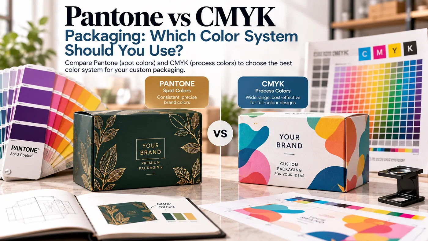
For Pantone vs CMYK packaging decisions, use CMYK for photos, gradients and many-color artwork. Use Pantone, a premixed spot ink, for one or two brand colors that must match every reorder. Pantone adds cost because each spot color needs its own ink. The board matters too, since one color prints differently on white, kraft, coated and uncoated stock.
Quick answer
- CMYK layers cyan, magenta, yellow and black dots. It suits photos, gradients and designs with many colors.
- Pantone is one premixed ink per color. It suits a signature brand color or a large solid field.
- Screens use light and boxes use ink, so no monitor will match a printed box exactly.
- A Pantone number ends in C (coated) or U (uncoated). Pick the one that matches your board.
- Pantone is worth the setup when a color is the brand. Skip it when the art is mostly photography.
Why printed packaging doesn't match your screen
A screen mixes red, green and blue light. A box reflects light off ink sitting on board. That's different physics. Bright blues, greens and oranges on a monitor often can't be printed with four process inks. Our CMYK vs RGB vs Pantone glossary guide covers the basics. This page covers the Pantone vs CMYK packaging buying decision. For the wider vocabulary, see the packaging glossary.
The board changes the result too. Pantone explains that ink sits atop coated paper with minimal absorption. Uncoated paper permits maximum absorption, so the same color looks quite different on each. Ink is also slightly translucent, so a brown board shows through.
CMYK process printing
In Pantone vs CMYK packaging, CMYK builds every color from four inks in tiny halftone dots. One job can hold unlimited colors, which is why photos and gradients use it. A new shade costs no extra ink.
The tradeoffs are real. Process inks can't reach every saturated color, and results can drift between runs. On uncoated board, dots swell as ink soaks in. Printing Impressions calls this dot gain, and it shifts color slightly.
Digital presses build color this way. EBP prints digital and offset, and offset can run spot inks in general. The right method depends on material, quantity and artwork, so confirm it on your quote. Our offset vs digital printing guide explains the split.
Pantone and spot color
A Pantone color is a premixed ink made to a numbered formula. It's mixed rather than built from dots. So it prints solid and can reach colors outside the CMYK range. On offset, each spot color usually means its own ink and plate.
Pantone sells a Color Bridge guide that pairs 2,587 spot colors with their closest CMYK matches. Note the word closest. A converted spot color is an approximation, not a clone.
Pantone's CMYK guide offers a useful workaround. It lists 2,868 CMYK colors that Pantone calls achievable on almost any conventional or digital press. Many have no spot-color equivalent. If your brand color isn't locked yet, pick it from a CMYK-first guide like this. Then the press has less to fight.
Coated vs uncoated board and kraft
In Pantone vs CMYK packaging, the suffix on a Pantone number names the paper the swatch used. Using the wrong book is a common reason a shade looks wrong on delivery.
Board | What happens to color | Practical move |
|---|---|---|
Coated white | Ink sits on top, so color looks richest | Use the C swatch book |
Uncoated white | Ink absorbs, so color looks softer and flatter | Use the U swatch book |
Kraft | Brown shows through, so color runs darker and earthier | Judge a physical sample, not the swatch |
Laminated or varnished | The finish changes how color reads | Proof with the finish on |
Lighter colors move less between coated and uncoated. Dark, saturated colors move the most, sometimes dramatically. CMYK is hit harder on kraft, because process color assumes a white sheet underneath. Our kraft paper guide shows how the board behaves.
Real packaging color examples
These Pantone vs CMYK packaging examples are qualitative, not test results.
- Dark navy on uncoated board: Expect it to look softer and less deep than the coated swatch. Request the U reference and a proof before approving.
- Metallic gold: CMYK can't print metallic. A "gold" built from CMYK reads as flat yellow-brown. Ask about metallic ink, or use foil stamping, for real shine.
- Gradient-heavy retail box: Cosmetics and fragrance art with soft fades need CMYK. Spot colors print flat solids.
- One-color logo on a kraft mailer: One spot ink often looks cleaner than CMYK on brown stock. Browse kraft boxes to see the base color first.
- Brand-red bakery box on white: A big solid red is where mixed ink earns its keep. Four-color builds can drift slightly between runs.
I've watched brands approve a navy on screen, then call it "muddy" on uncoated stock. The color wasn't wrong. The board was absorbing it.
Digital vs offset: what changes for color
In Pantone vs CMYK packaging, digital printing builds color from CMYK, so a spot color is simulated. That's fine for most brand blues and greens. It's riskier for neons, deep corporate shades and anything metallic.
Offset can use CMYK or spot inks, and it's the usual choice for larger runs. EBP offers low MOQs. Our manufacturing page shows where artwork and color review sit in production.
Which costs more in Pantone vs CMYK packaging?
We don't quote prices here, because EBP is quote-based. The pattern is consistent, though. A full-color design costs about the same however many shades it holds. Each added spot color adds an ink and usually a plate.
A one-color kraft logo in one spot ink can cost less than a four-plate CMYK job. A design with five spot colors will cost more. Ask for both options on one quote.
Pantone vs CMYK packaging: which should you choose?
Brand situation | Use CMYK | Use Pantone or spot | Why |
|---|---|---|---|
Photo-heavy retail box | Yes | No | Spot inks can't render photos |
Gradients or soft shadows | Yes | No | Dots blend smoothly |
One signature color on every SKU | Maybe | Yes | Mixed ink holds the shade across reorders |
Logo in one or two colors | Maybe | Yes | Fewer inks, crisp solids |
Metallic gold or silver look | No | Metallic ink or foil | CMYK has no metallic |
Kraft board, simple art | Maybe | Yes | Spot ink is easier to predict on brown |
Tight budget, many colors | Yes | Only for the logo | Extra spot inks add cost |
Dark navy on uncoated board | Test it | Test it | Both shift, so proof both |
How brands keep color consistent
- Write a one-page color spec. List the Pantone number with C or U, an approved CMYK build, and the board for each.
- Keep the same board and print method between reorders when you can.
- Approve a physical proof or sample, and keep it as your reference.
- View proofs under the same controlled lighting every time.
- Treat any new board as a new color test.
Pantone says its CMYK guides are calibrated to G7 specifications. That gives printers a shared target.
Proofing for color
A PDF proof checks layout. It can't confirm Pantone vs CMYK packaging color on your board. For color-critical jobs, ask what physical proof or sample fits your job. Read our print proofs explained guide first. You can also order the sample kit to feel real board before you commit.
What to send your packaging manufacturer
- Product dimensions, weight and quantity
- Box format and structure
- Artwork status and file type (vector or placed images)
- Pantone numbers with C or U, plus CMYK values
- Board choice: white, kraft, coated or uncoated
- Printing preference: digital, offset or open to advice
- Finishing: lamination, foil, spot UV
- Inserts and extras
- Delivery destination and required date
- Reference sample if you have one
Key takeaway
For Pantone vs CMYK packaging, choose CMYK for imagery and Pantone for the color that is your brand. Then confirm the board and proof it before production.
Color results vary by board, press and finish, so test a sample before full production.