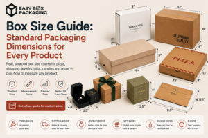

Mistake 1: The Box Is Too Big for What’s Inside
You can hear it before you open it. That hollow thud when the courier drops it on the porch. Inside, the product has shifted to one corner, the void fill has compressed to nothing, and the item’s been bouncing against the walls since it left the warehouse.
This happens because most brands start with a stock box size rather than their product’s actual packed dimensions. Stock sizes are convenient. They’re also frequently wrong.
Here’s where it gets expensive: carriers charge by dimensional weight — that’s L × W × H divided by a DIM factor — not just actual weight. A product that weighs 3 lbs in a generously oversized box can be billed to you at the equivalent of 37 lbs. Do that across 2,000 units and you’ve handed your carrier a significant bonus for the privilege of shipping poorly.
The fix: Measure your product fully packed — with any tissue, inserts, or accessories — and add no more than 1 to 2 inches of clearance per side. That’s enough for protective padding to work. Anything beyond that is dead space you’re paying to ship.
Custom sizing isn’t as expensive as it used to be, and it pays for itself fast. At Easy Box Packaging, we start every project from your product’s actual dimensions, not a catalog of stock options. It makes a bigger difference than most clients expect. If you’re considering custom mailer boxes specifically, sizing precision matters even more — mailers have less structural redundancy than rigid boxes.
What you’ll learn in the rest of this article:
- The structural mistakes that cause the most expensive problems (not the visual ones)
- How dimensional weight charges can multiply your shipping costs on an oversized box
- Why the interior of your box matters as much as the exterior
- The corrugated flute guide most brands never get shown
- Why skipping a sample is how $200 problems become $6,000 problems
Time to read: 10 minutes
Mistake 2: The Exterior Design Gets Too Complicated to Print Well
On your screen it looks sharp. Fine script font, a gradient fading from forest green to sage, four spot colors, a hairline border around the edge. Then the physical box arrives and the gradient has banded, the fine lines have blurred into a soft smear, and the whole thing looks like a slightly disappointing knockoff of what you imagined.
Corrugated board is not coated paper. Its surface is porous, textured, and slightly irregular — ink absorbs differently depending on where you are on the flute. The RGB color space that makes your screen look beautiful translates poorly to CMYK on kraft board. What you’re designing for is a moving, fibrous surface, not a glossy magazine page.
You’ve probably seen this one play out. Common printing errors we’ve flagged:
- Fine lines below 0.5pt that bleed and disappear
- Script fonts that lose legibility below 10pt
- Gradients that band visibly due to ink absorption variation
- Six-color designs that become visual noise once printed on natural kraft
The fix: Design for the medium. Limit yourself to two or three solid colors. Use line weights above 0.5pt. Convert your files to CMYK before you submit them, not after. And always — always — request a physical press proof before approving a full production run. Looking at a digital proof on your monitor is not the same thing. Not even close.
Under 500 units, go digital. Anyone quoting you plate setup fees on a 200-unit run is either not set up for small brands or hoping you don’t notice.
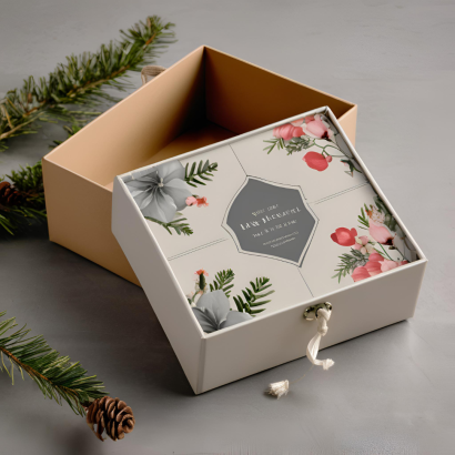
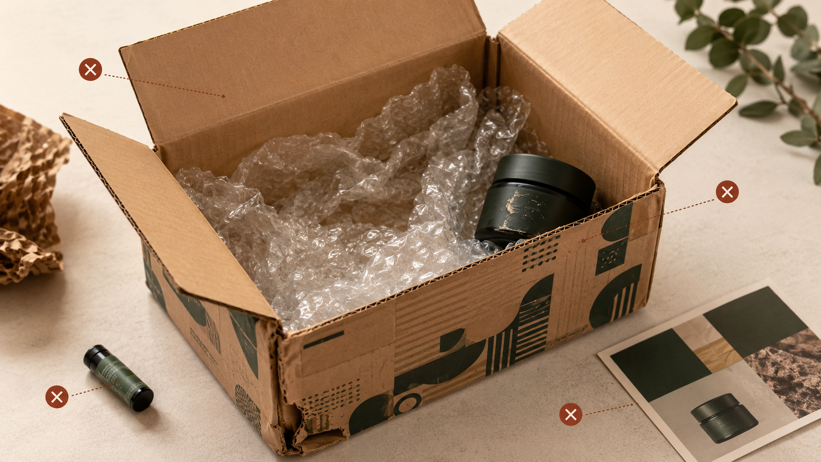
Mistake 3: All the Budget Went Outside — the Inside Is an Afterthought
The exterior is beautiful. Embossed logo, matte laminate, clean typography. You open it and there’s the product sitting in a bare brown box. No tissue. No insert card. Just the item and some bubble wrap you could’ve found in any Amazon shipment.
This is one of the most common unboxing experience mistakes we see from brands who’ve invested in packaging design for the first time. The outside gets treated as marketing. The inside gets treated as logistics. And the person actually opening the box notices the difference immediately.
Research suggests that branded tissue creates significantly greater brand recall at 60 to 90 days compared to plain void fill — same product, same box, different interior experience. Studies also indicate that customers who received tissue paper estimated the value of the product higher than those who didn’t. Same product. The packaging was doing the pricing work.
You don’t need to go overboard. Even a single interior print panel — the inside of the lid, for example — or a small branded insert card shifts the perception of the entire order. And honestly, it’s often cheaper than people assume.
I’ll put it plainly: if you’ve spent money on the exterior and nothing on the interior, you’ve built a beautiful door to an empty room. The customer spends three seconds looking at the outside and thirty seconds inside the box. Budget accordingly.
Mistake 4: The Corrugated Thickness Wasn’t Right for the Job
Corrugated board works as a structural column. The fluted layer running between the liners isn’t just filler — it’s load-bearing, distributing vertical compression across the whole box. But when the flute is too light for the product, it collapses. Not all at once — it slowly crumples under the weight of boxes stacked above it in transit.
This is one of the packaging design errors that brands discover when they get a damage claim. Not before. Never before.
I’ve had conversations with founders who genuinely didn’t know corrugated flute types existed. Nobody told them. That’s not a knock on them — it’s a knock on how suppliers usually sell. Most quote forms don’t ask about stacking loads or transit conditions. They ask for dimensions and quantity. The rest gets filled in with whatever’s cheapest.
A rough guide to corrugated flute types:
- E-flute (1–1.5mm): Thin, smooth finish. Good for retail boxes, cosmetics, small consumer products that aren’t being stacked heavily.
- B-flute (approximately 2.5–3mm): Good compression strength. Works well for glass, canned goods, products with some weight to them.
- C-flute (approximately 3.5–4mm): The most common for general e-commerce shipping. Good all-around strength.
- BC double-wall: Two flute layers bonded together, typically reaching 6–7mm total thickness. For heavy, fragile, or high-value items where damage would be expensive.
Here’s why this matters physically: the corrugated flute operates as a column structure under vertical load. Each wave of the flute acts like a tiny arch — incredibly strong when force comes straight down, but prone to buckling when crushed at an angle or when the board is wet. So boxes stacked awkwardly in a wet truck collapse at the corners while the center panel holds. Understanding the failure mode tells you how to specify against it.
What works instead: Don’t just ask your supplier for “single wall” or “double wall.” Ask for the ECT rating — that’s edge crush test, and it tells you how much vertical load the box can actually handle before deforming. Your supplier should be able to match flute type to product weight and stacking conditions. If they can’t, find a supplier who can. Flute requirements also vary significantly by industry — see our guide to industry-specific packaging for category-by-category breakdowns.
Mistake 5: Nobody Ordered a Sample Before Going to Production
A tea startup we heard about skipped the physical sample stage. They placed an order for 10,000 pouches, got excited, started building their marketing around them. And when the order arrived, the color was noticeably off from the approved digital proof, and the zipper closure — the one feature that was central to the resealable design — failed on a significant portion of the run. The cost of a sample run would have been around $200. The cost of an unusable batch was close to $6,000 — though figures like these vary significantly by order size and specification.
This isn’t a rare story. It’s one version of something that happens more often than any supplier wants to admit.
Digital proofs can’t tell you how a box feels in your hand, how stiff the flap is, whether the print holds true under natural light, or whether the insert card fits without forcing. Those things only exist in three dimensions.
— Order a physical sample and actually test it. Close it. Stack it with a product inside. Shake it. Photograph it in the lighting conditions your customer will actually see it in. If something feels wrong on the sample, it will feel wrong on 5,000 units. This is not optional. It’s the only moment in the process where you have leverage before the money is spent.
Easy Box Packaging includes physical prototyping as a standard step before any full production run — not an optional extra. Prototyping adds a week or two before production approval. We build that in explicitly because the alternative is discovering problems after 5,000 units have been printed, and nobody wins in that scenario.
Mistake 6: The Cheapest Supplier Quote Won
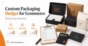
The math on this one looks fine until it doesn’t. Say you save $0.20 per unit by going with the lowest bidder. On a 1,000-unit run, that’s $200 saved. Good.
Now say even a small percentage of your orders arrive with transit damage — slightly crushed corners, print that’s rubbed off on the edges, inserts that have come loose. Each damage-related return can cost roughly $20–$30 or more to process, depending on your category: return shipping, inspection, repackaging, customer service time, potential replacement. Across even a handful of affected units, that’s potentially thousands of dollars in hidden costs.
I’ve seen brands run this math and convince themselves the savings matter. They don’t. Not once they’ve lived through a damage claim.
The problem is that print consistency, damage rates, and communication quality don’t appear on the quote. They appear six weeks later when the shipment arrives — by which point it’s too late to renegotiate. Ask for samples from multiple print runs, not just one proof. A supplier who prints consistently across runs will give you the same quality in month eight as they did in month one. Ask how they handle damage claims. Ask about their rejection rate. Those answers are more useful than the per-unit price.
Mistake 7: Nothing Is Holding the Product in Place
Shake a sealed box with your product inside. If you can hear it move, something is wrong.
Products shift in transit. Glass items clink against each other. Candles scuff against the box wall and arrive with scratched surfaces. Skincare bottles tip onto the insert card and leave oil stains. And none of this is visible from the outside, which is why it often gets attributed to “shipping damage” when it’s actually a design problem that a low-cost insert would have fixed.
A simple E-flute cardboard insert — die-cut to hold the product in a fixed position — typically costs between $0.05 and $0.15 per unit for simple, high-volume designs, though prices vary by complexity and order size. That’s the cost of eliminating product movement entirely. This is also the step that turns a functional box into an unboxing experience. When everything is held in place and the product sits exactly where it’s supposed to sit, opening the box feels intentional. It feels like someone thought about this.
Design the protection before you design the interior aesthetics. Once you know how the insert sits, the tissue drapes naturally around it and the insert card has a clear home. Easy Box Packaging can spec custom inserts alongside the box order, so the fit is exact rather than approximate.
The Pattern Behind All These Custom Box Design Mistakes
Brands design the visual experience first and figure out the structural requirements later.
That order makes sense from a brand perspective — you know what you want it to look like, so you start there. But a box is a structural object before it’s a visual one. The corrugated thickness determines what print finishes are possible. The insert design determines where the product sits, which determines how much interior space is left for tissue and cards. The packed dimensions determine the right box size, which determines the DIM weight, which determines your shipping cost.
When those decisions get made in reverse — visual first, structure later — you end up discovering the constraints at the sample stage or, worse, at the production stage. That’s where the expensive surprises live.
Design the structure first. Let the visual layer sit on top of it.
FAQ
What’s the most common custom box design mistake brands make?
Sizing. The box being too large for its contents is the single most common mistake we see, and it’s also the most expensive — both in carrier fees (dimensional weight) and in the customer experience. A product that arrives rattling in an oversized box signals low quality before the packaging is even open.
Do I really need a physical sample before my first production run?
Yes. A digital proof will show you color and layout on a flat surface. It won’t show you how the box feels, whether the flute holds under real stacking pressure, how the print looks in natural light, or whether your product actually fits the way you imagined. Skipping the sample is how small upfront savings turn into large downstream costs.
How do I know which corrugated thickness I need?
Start with your product weight and fragility. E-flute for lightweight retail products under about 2 lbs. B or C-flute for general e-commerce shipping. Double-wall for heavy, fragile, or high-value items. Then ask your supplier for the ECT (edge crush test) rating — that’s the number that actually tells you how much vertical load the box can handle in a real transit stack.
Conclusion
I’ve watched brands make every mistake on this list. The expensive ones aren’t the design failures — they’re the sequencing failures. Brands get attached to the visual before they’ve answered a single structural question, and then they discover those questions have answers that contradict the design they’ve already fallen in love with.
Fix the order of decisions and most of the rest solves itself. Flute type first. Insert design second. Packed dimensions third. Then make it beautiful. That sequence isn’t glamorous but it’s what separates a box that earns a reorder from one that generates a return.
The brands I’ve seen do this right aren’t more experienced or better-resourced. They’re just willing to slow down before the first order, not after. That’s the whole thing, really.
If you’re based on the East Coast, our team works closely with brands on custom packaging in New York — same process, same attention to structure-first design, just closer to your timeline.
Pricing and MOQs vary by specification — request a custom quote for accurate details. Results vary by product and handling conditions; we recommend testing samples before committing to a full production run.