
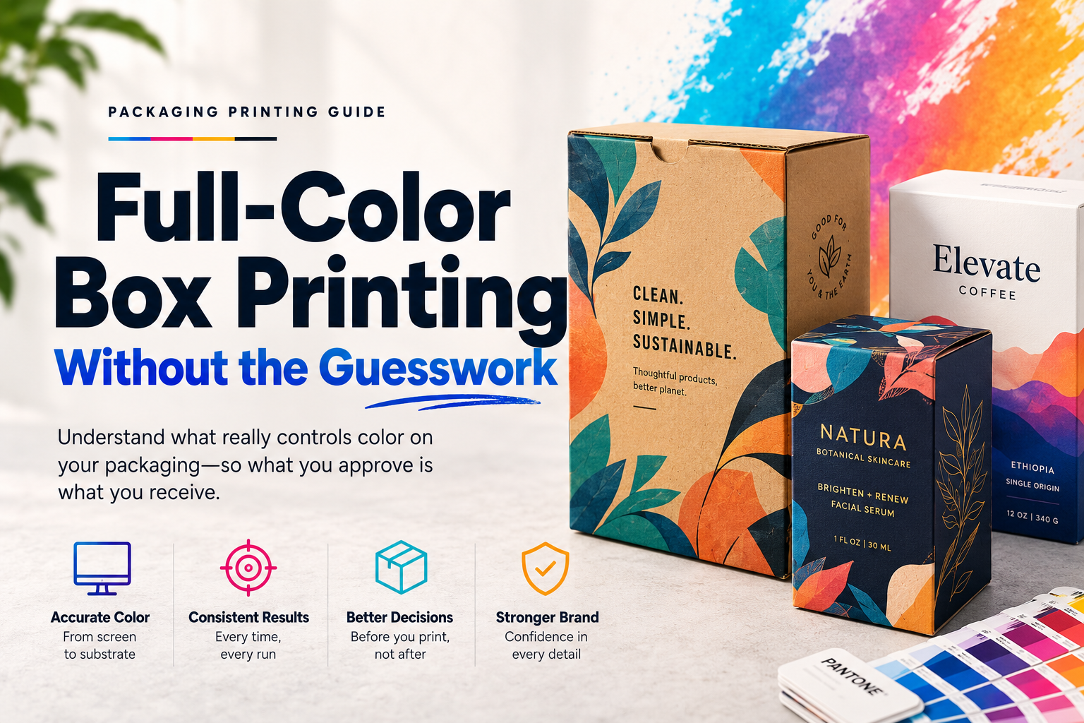
The most common full-color box printing problem isn’t technical. It’s this: a brand approves a proof that looks great on a monitor, gets the production run, and opens a box to find the colors are darker, muddier, or completely off from what they expected.
This isn’t a supplier mistake. It’s a gap in how most brands think about printing — specifically, what happens between a color on a screen and ink on cardboard.
Full-color custom box printing looks simple from the outside. You upload a file, pick a quantity, pay, wait. But color in print works by completely different rules than color on a screen, and corrugated or kraft substrates compound the issue in ways that catch brands off guard every time.
This guide covers what actually controls color output on your boxes — and what to fix before you send artwork.
Why Your Screen Colors and Your Box Colors Are Different
Your monitor produces color by emitting light — red, green, and blue combined at different intensities (RGB). Every color you see on screen is additive: more light equals brighter. Print works the opposite way. Ink is subtractive. Cyan, magenta, yellow, and black (CMYK) are layered onto a substrate, and each layer absorbs light rather than emitting it. The result is inherently different from what a screen shows.
The first thing to do before sending any print file: convert your artwork from RGB to CMYK. Most design software does this in one step. If you send an RGB file to a print supplier, they will convert it for you — but their conversion algorithm and your screen calibration almost certainly disagree, and you will not like the result.
Beyond RGB vs CMYK, there’s another factor: dot gain. When ink hits an uncoated substrate like corrugated kraft, the tiny ink dots spread slightly as they’re absorbed. Colors print darker and slightly less sharp than the digital proof predicts. On coated white board, dot gain is controlled and minimal. On natural kraft, it’s significant — especially in shadow areas and dark colors.
What looks like a rich navy blue on your screen can arrive as a dull, near-black on an uncoated brown kraft box. That’s not an accident — it’s physics.
CMYK vs Pantone — Which One Does Your Brand Actually Need?
CMYK (process printing) mixes four ink colors to approximate any hue. It’s the default for digital printing and most offset runs. It handles photography, gradients, and complex imagery well — a photo of your product on a box requires CMYK.
Pantone (PMS or spot color) uses pre-mixed ink formulas. PMS 286 C is the same exact blue whether it’s printed in Michigan, California, or six months apart. For brand marks and logos that must match precisely across all materials — Pantone is the more reliable choice.
Where brands make the expensive mistake: choosing Pantone for a four-color design. If your box has photography, gradients, or more than three distinct brand colors, Pantone requires a separate printing plate per color. Each plate adds cost. At that point, CMYK process printing is almost always cheaper and produces better results for that type of artwork.
Practical rule:
- Logo on a solid background, 1–3 colors, must be exact: Pantone
- Photography, gradients, or 4+ colors: CMYK
- Lifestyle product shots on the box exterior: CMYK
- Brand mark used across retail, display, and packaging: Pantone, then convert to CMYK for production with a documented acceptable delta
One thing worth knowing: if Pantone is your spec but digital printing is your method, Pantone spot colors are simulated in digital — approximated using CMYK inks, not mixed from the actual formula. For true Pantone accuracy, you need offset or flexo.
How Your Substrate Changes the Color You Actually See
The substrate — the material your box is made from — affects final color as much as the print method does. This is the piece most brands don’t discover until they’re holding a production sample.
White-lined corrugated or folding carton: CMYK prints behave close to how they look on screen. The white background acts as CMYK assumes it should. Color is clean, bright, and predictable.
Natural kraft corrugated: Brown is now part of your palette whether you want it or not. CMYK inks are translucent — the brown kraft base layer shows through and shifts every color. Blues go green-gray. Reds go brick. Light yellows disappear. Colors overall print darker and warmer.
If your brand requires accurate color on kraft, you have two practical options:
- White underprint: A layer of white ink is printed first as a base, then your CMYK colors go on top. This restores color accuracy significantly. It adds cost — typically $0.08–0.15 per unit — but it’s the only way to get a true brand blue on a kraft box.
- Litho-laminated corrugated: A full-color sheet is printed on white coated cardstock, then laminated to corrugated board. The result is the structural strength of corrugated with the print quality of a folding carton. Premium brands use this for retail packaging where color accuracy matters.
I’ve watched brands run five rounds of digital proofs on kraft trying to hit a specific brand color, then get frustrated when production doesn’t match. The problem isn’t the supplier — it’s that no proof on a monitor accurately represents ink on an uncoated brown substrate. Request a physical strike-off on your actual production material before approving anything.
Setting Up Your Artwork File Correctly
This is where most color problems start — in the file, before it ever reaches a press.
File format: Supply print-ready artwork as PDF (PDF/X-4 preferred) or AI. JPEG and PNG are acceptable for some digital suppliers but they compress detail and lose exact color data. If you’re spending real money on boxes, send print-ready vector files.
Color mode: CMYK, not RGB. Check your document settings before exporting. If your design was built in RGB, convert the document color mode to CMYK and inspect every color for shift before sending.
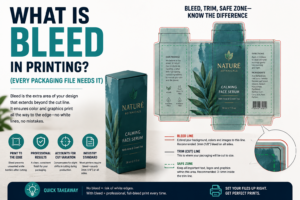
Bleed: Add at least 0.5 inches (12–13mm) of bleed beyond the cut line on every edge. Without bleed, any slight shift in cutting leaves a white or unprinted edge that looks like a mistake. This is not optional.
Trapping: Set at minimum 3/16 inch (about 5mm) where colors meet. This compensates for small misregistration on press and prevents visible gaps at color boundaries.
Resolution: 300 DPI at the final print size for raster images. Images pulled from websites are typically 72–96 DPI — they will print visibly blurry at box scale.
Pantone to CMYK conversion: Get the CMYK equivalent from the official Pantone color bridge guide — not an online converter, which often produces inaccurate values. Document the accepted CMYK values for every brand color and include them in your print brief.
Getting a Real Proof Before You Commit
Digital proofs — the PDF or screen image your supplier sends before production — are useful for checking layout, text, and structure. They are not reliable for color accuracy.
The only proof that tells you what your box will actually look like is a physical press proof or strike-off on the production substrate. This means a sample printed on the same paper, with the same inks, on the same press type your production run will use.
For runs under 500 units, ask for a printed sample shipped to you before final approval. Some suppliers charge $30–80 for this; it’s worth every dollar compared to reprinting a full run.
For offset and flexo runs, always insist on a physical press proof. At those volumes, reprinting due to a color issue costs far more than the proof.
When your physical proof arrives:
- Hold it next to your brand style guide or Pantone chip book — not your screen
- Check corners and edges for bleed coverage
- Check dark areas for excessive mudding or fill
- Fold along the score lines; confirm printing at creases doesn’t crack or flake
- Confirm all text is sharp and readable at small sizes
If anything is off on the proof, it will be off on 2,000 units. Catching it here is the entire point.
Full-Color Printing by Box Type
Corrugated shipping boxes: Most commonly printed with flexo — excellent for solid colors and simple designs, but struggles with fine detail and photography. If you need full-color photography on a corrugated shipper, litho-lamination is the right answer, not flexo.
Folding cartons (paperboard): Print beautifully with digital or offset. White coated board gives CMYK a clean base. Most retail packaging — cosmetics, food, apparel — uses folding cartons for this reason.
Rigid boxes: Typically printed on paper wraps using offset, then wrapped around a chipboard structure. Foil stamping, embossing, and spot UV are applied as secondary processes after the base print.
Mailer boxes: Corrugated construction, printed with digital or litho-lam depending on volume and quality. For custom mailer boxes with full-color exterior branding, digital printing at low MOQ or litho-lam at scale are the two standard paths.
Questions to Ask Your Supplier Before You Approve
What is your press’s TAC limit? Total area coverage affects how dark and saturated your prints can go before ink smears or doesn’t dry. Most corrugated presses run TAC at 280–320%. Artwork exceeding the limit will shift in production.
Do you apply dot gain compensation in prepress? The supplier’s RIP should apply dot gain compensation to account for how the substrate absorbs ink. Without it, shadow areas block up and lose detail.
What substrate are you printing on? Ask for the board grade, liner type (white top liner vs natural kraft), and caliper. These determine your color behavior more than any other single factor.
Can I see a physical proof on the production substrate? Not a digital PDF — a printed sample on the exact paper the production run will use.
How do you handle Pantone-to-CMYK conversion? If you’ve supplied Pantone values and they’re converting, what CMYK equivalent are they using and how will they confirm the match?
Understanding how packaging drives repeat purchases means investing in the details customers notice on first open — and color accuracy is one of those details. The brands that avoid common packaging print mistakes are the ones asking these questions before the run, not after.
FAQ: Full-Color Custom Box Printing
What file format should I send for custom box printing?
PDF/X-4 is the preferred format for most professional print suppliers. Adobe Illustrator (AI) files are also widely accepted. Avoid JPEG and PNG for final artwork — they compress detail and don’t reliably preserve exact color data.
Why do my box colors look different from my screen?
Screens emit light in RGB. Print absorbs light in CMYK. The two systems produce color through opposite mechanisms, so an exact match is never guaranteed. The substrate — especially uncoated kraft — shifts colors further. Request a physical proof on your production material to see what you’re actually getting before committing to a full run.
When should I use Pantone vs CMYK for my boxes?
Use Pantone when you have 1–3 critical brand colors that must be consistent across all materials and you’re printing offset or flexo. Use CMYK when you have photography, gradients, or 4+ colors, or when printing digitally. For most full-color ecommerce packaging, CMYK is the practical choice.
What is dot gain and how does it affect my boxes?
Dot gain is what happens when ink dots spread slightly on contact with an absorbent substrate. Colors print darker and slightly less sharp than your digital proof suggests. Most noticeable on uncoated kraft — ask your supplier how they compensate for it in prepress settings.
Can I get accurate color on a natural kraft box?
Yes, but it requires either a white underprint (white ink applied before your colors) or litho-lamination. Without one of these methods, kraft’s brown base will shift every color in your design — sometimes significantly.
What’s the minimum bleed I need for box artwork?
0.5 inches (12–13mm) on every edge. Bleed ensures that slight variations in cutting don’t leave a visible unprinted edge on the finished box. Some suppliers accept 3mm for simpler structures — confirm before finalizing artwork.
What does “TAC limit” mean and why does it matter?
TAC (total area coverage) is the maximum combined ink percentage a press can apply without smearing or poor drying. Usually 280–320% for corrugated. Artwork exceeding the limit causes colors to shift or bleed in production — your prepress team should flag and adjust this before printing.
The Print Accuracy Takeaway
Full-color box printing is predictable when you know the rules — and expensive when you don’t. RGB files, approvals on uncalibrated screens, and proofs that don’t reflect production substrates are how brands end up reprinting runs at double the cost.
The fix is straightforward: convert to CMYK before you send anything. Add bleed. Know your substrate. Get a physical proof on the actual material before you approve.
Easy Box Packaging walks brands through the proof process before production so there are no surprises when the run arrives. If you want to understand how printing decisions fit into your broader packaging spend, the custom packaging budget guide covers where to invest and where to trim. And if you’re still deciding between digital, offset, and flexo for your next run, our guide to custom packaging printing methods covers the trade-offs in full.