
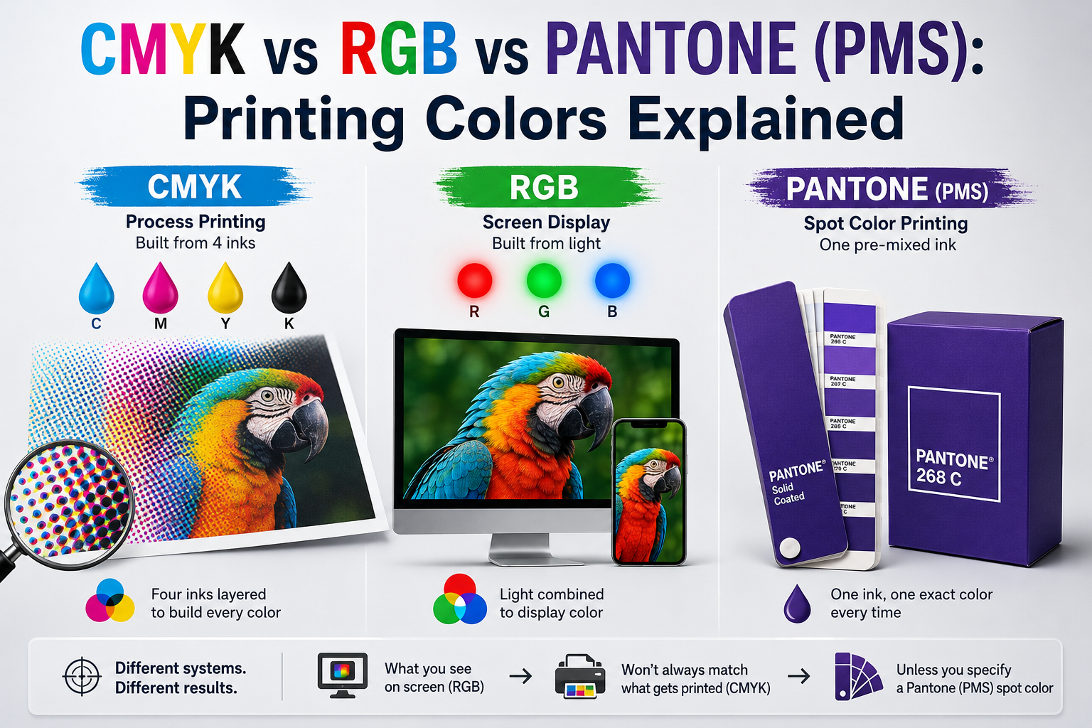
CMYK vs RGB vs Pantone: what’s the real difference? CMYK and Pantone are both print color systems. RGB is a screen color system instead. CMYK builds colors from four inks layered together. Pantone uses a single pre-mixed ink matched to an exact shade. RGB builds colors from red, green, and blue light instead of ink. The CMYK vs Pantone choice comes down to process printing versus one exact spot color. That’s why a color on your monitor never looks quite the same once it’s printed on your box.
How Each Color System Actually Works
CMYK stands for cyan, magenta, yellow, and black. A printer layers tiny dots of these four inks to build every color in your design. It’s called process printing, since the color comes from a mixed process rather than one ink.
The “K” stands for black, not the last letter of “black” itself. Printers use “K” to avoid confusion with blue in earlier color abbreviations. That naming quirk has stuck around since early four-color printing.
Pantone works differently. Each Pantone color is a single, pre-mixed ink made to an exact formula. There’s no layering involved. That’s why Pantone colors stay more consistent from run to run than CMYK does.
Pantone colors are often called PMS colors, short for Pantone Matching System. Every PMS color has its own reference number, like PMS 286 for a specific blue. That number lets a printer mix the exact same ink anywhere in the world.
RGB isn’t a printing system at all. It’s how screens display color, using red, green, and blue light. Your monitor, phone, and printed box all show color in completely different ways. That mismatch is the root of almost every “the color looks wrong” complaint in packaging.
RGB can display a wider range of colors than CMYK ink can reproduce. Screens generate light directly, while ink absorbs and reflects it. That’s a physical difference, not a settings problem, so no amount of monitor adjustment fully closes the gap.
CMYK vs RGB vs Pantone Compared
| System | How It Works | Best For | Consistency |
|---|---|---|---|
| CMYK | Four inks layered together | Full-color designs, photos | Can shift slightly between runs |
| Pantone | Single pre-mixed ink | Exact brand colors, logos | Very consistent run to run |
| RGB | Red, green, blue light | Screens only, not print | Not applicable to physical print |
Most packaging jobs use CMYK for the bulk of the design. Pantone handles one critical brand color, like a logo.
Why Screen Colors Never Match Print Exactly
Your monitor displays in RGB. Your printed box comes out in CMYK or Pantone ink. Those are two different physical processes, so a perfect match isn’t really possible. Monitor brightness, calibration, and even ambient lighting all shift how a color looks on screen.
According to Pantone’s own color-matching guidance, physical color swatches remain the standard for confirming an exact shade. That standard applies before any production run starts. A digital file alone can’t guarantee what ink will look like on board. That’s true even with a well-calibrated monitor.
This is exactly why a physical proof matters more than a screen preview. A PDF proof on your laptop can look noticeably different from the printed result. The same design can shift once it hits your actual box material.
Some printers offer a calibrated soft-proof as a middle step. It’s closer to true print color than an uncalibrated monitor, but it still isn’t the final word. A physical proof on your actual board remains the only real way to confirm a color. Do this before any full run.
Where Color Matching Goes Wrong
Most guides just say “colors may vary.” Here’s what they don’t explain. CMYK can’t reproduce every color RGB can display. Bright neons and certain deep blues fall outside CMYK’s range entirely. A design built in RGB and converted to CMYK late in the process can shift more than expected.
Board material changes the read too. The same ink looks different on coated stock versus uncoated kraft. Kraft especially can shift colors warmer, since the natural brown base mixes with the ink itself.
Here’s the one that catches brands off guard: a home inkjet printout isn’t a real production proof. Approving color from one doesn’t guarantee the other. I’ve had a client approve a logo color from a desktop printout. The actual press run came back a noticeably different shade. Home printers use their own ink formulas, completely separate from commercial CMYK or Pantone. Ask your printer for an actual production proof before signing off on a critical brand color. Skip any version printed on office equipment. Approving the wrong shade at this stage is one of the packaging mistakes that kill the unboxing moment. It happens long before a customer ever opens the box.
What Color Matching Adds to Your Quote
Pantone spot colors add a cost that CMYK alone doesn’t. Each spot color needs its own ink and its own pass through the press. A design using two or three Pantone colors plus CMYK costs more than a CMYK-only design.
Some printers offer a hybrid option. CMYK covers most of the design, with one Pantone pass reserved for a single logo or accent color. It’s a middle ground. You keep most of CMYK’s cost savings while still locking in one exact brand color.
Physical color proofs add a small cost too, but they’re worth it on any brand-critical color. Request a quote that includes proof options for your specific design and color count. It’s a small line item. Compare that to the cost of a full reprint if the color comes back wrong.
Offset printing typically handles Pantone colors more precisely than digital printing does. Digital presses simulate Pantone using CMYK-style mixing. That can come close, but it rarely matches an exact spot color the way true offset ink does.
Turnaround shifts slightly with more colors. Each Pantone pass adds a small amount of press time. A simple CMYK-only design moves through production a bit faster than one with several spot colors layered in.
Minimum order quantities can shift with color count too. A design with several Pantone colors sometimes carries a higher minimum. The extra press setup makes short runs less efficient. Ask your printer whether your color count affects the minimum quantity before finalizing a design.
Which Should You Choose?
Printing full-color photography or complex gradients? CMYK is the only realistic option. Its four-ink process handles a wide color range well, even if it can’t match every possible shade.
Need your exact brand logo color on every single box? Pantone is worth the extra cost. It holds far more consistently across print runs than CMYK does.
Working with a tight budget on a simple design? CMYK alone keeps costs down. Skip Pantone unless one specific color truly needs to match exactly every time.
Printing on kraft or another uncoated stock? Ask for a physical proof on that exact material. Color shifts more on kraft than it does on coated board. A screen preview won’t show you that shift ahead of time.
Displaying your box under retail lighting rather than daylight? Ask to see the proof under similar lighting if possible. Some colors shift noticeably under warm store lighting compared to daylight or a home office.
Building a logo-heavy design for custom mailer boxes or another repeat-order item? Get the Pantone match locked in once. That consistency is exactly the kind of detail that turns a first order into a repeat one.
CMYK vs Pantone: FAQ
What’s the difference between CMYK and Pantone?
CMYK builds color from four layered inks. Pantone uses one pre-mixed ink matched to an exact formula. Pantone holds more consistently across print runs.
Can Pantone colors be printed using CMYK?
Yes, but it’s an approximation, not an exact match. True Pantone accuracy requires the actual pre-mixed spot ink, not a CMYK simulation.
Why does my logo look different on screen than on my printed box?
Screens display in RGB light. Printed boxes use CMYK or Pantone ink. Those are different physical processes, so an exact match isn’t guaranteed without a physical proof.
Do I need Pantone colors for my packaging?
Only if one specific color, like a logo, needs to match exactly on every order. CMYK alone works fine for most full-color designs.
Does board material affect print color?
Yes. Coated and uncoated stocks reflect ink differently. Kraft’s natural brown base can shift colors warmer than a white background would.
Color consistency isn’t just a design detail. It’s what makes a box look the same on order one and order fifty. Confirm critical colors with a physical proof, not a screen preview, before any full production run ships.