
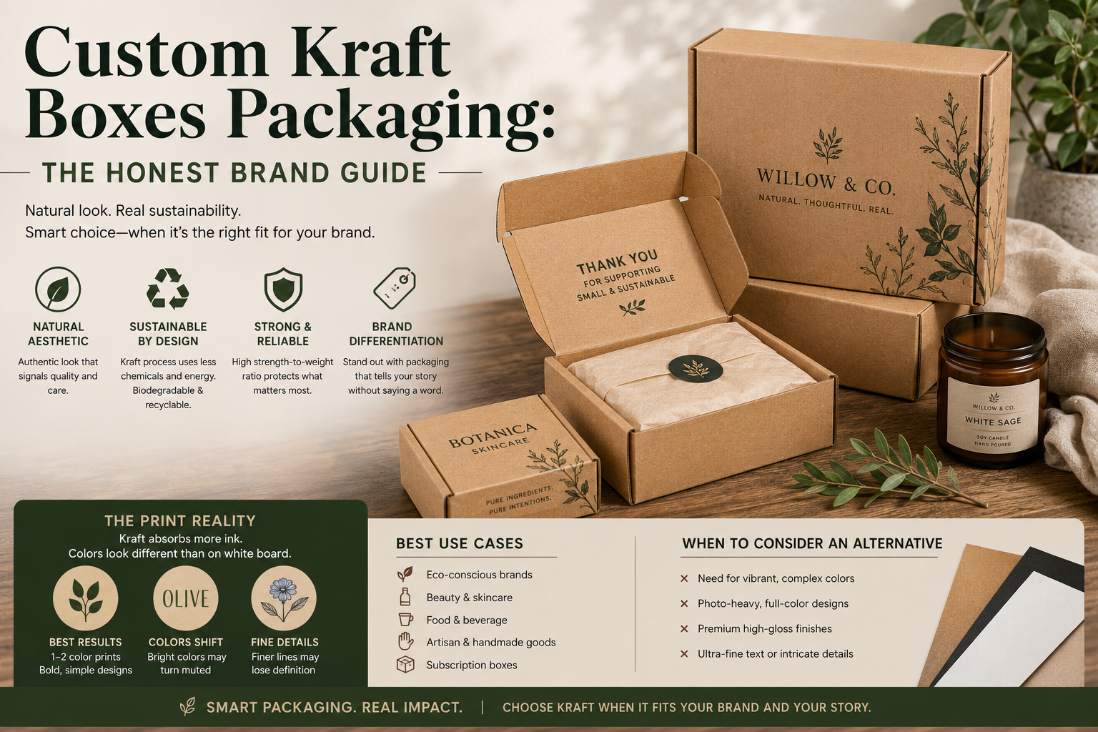
Walk through any artisan market. Open a DTC subscription box in the natural food or beauty space. You’ll see the same thing: brown boxes. Kraft mailers. That natural, uncoated look that signals “we care” before anyone reads the copy.
The trend is real. Custom kraft boxes packaging has grown steadily for five years. It looks good and it has a real sustainability story. Most packaging materials make you choose one or the other. Kraft managed both at once, and brands noticed.
But there are tradeoffs most guides skip. Kraft has real print limitations. I’ve watched brands order 1,000 units of custom kraft boxes packaging and open the delivery to find their teal had turned olive. Nobody warns them beforehand.
This guide covers what kraft is, why brands are choosing it, and exactly where it earns its place — and where it doesn’t.
What Kraft Actually Is (and Why It’s Brown)
The word “kraft” comes from the German and Swedish word for strength. It’s not a design aesthetic. It’s a manufacturing process.
Kraft paper and board are made using the kraft pulping method. Wood chips are cooked in a chemical solution that breaks down the lignin holding wood fibers together. The solution uses sodium hydroxide and sodium sulfide. This preserves more long cellulose fibers than older papermaking methods. That’s why kraft board is stronger than most bleached alternatives at the same weight.
The brown color isn’t a style choice. It’s what you get when you only partially remove lignin. Bleached white board (SBS — Solid Bleached Sulfate) goes through extra processing to get that bright white surface. Kraft skips that step. Fewer chemicals, lower energy use, shorter process. The brown color is the byproduct of doing less to the material. That’s what makes it a real sustainability signal, not a cosmetic one.
Custom kraft boxes packaging has a genuine environmental story. It’s not “recycled-looking packaging” dyed beige. The material itself is simpler to produce.
For brands that want third-party verification, FSC certification is widely available on kraft board. It confirms responsible forest management from source to supplier. Worth asking for if your brand talks sustainability publicly.
Why Brands Are Choosing Custom Kraft Boxes Packaging
It signals authenticity. Brown kraft reads as handcrafted, natural, and honest. That’s not accidental. Years of use by artisan brands have built real meaning into the material. Coffee roasters, candle makers, botanical skincare brands — they all adopted kraft because it matches what they are. When customers see it, they read “made by people who care.”
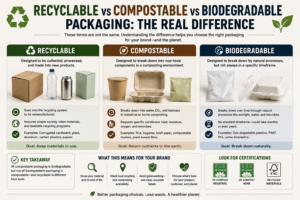
The sustainability case holds up. Kraft has a defensible story. It’s biodegradable. It’s recyclable curbside in most places. The process is less chemically intensive than bleached board production. If your brand makes sustainability claims, kraft backs them with material facts — not marketing language.
It photographs well. This is underrated. Brown kraft in soft natural light looks beautiful. It’s especially strong for lifestyle brands whose imagery leans warm or minimal. The substrate’s warm tones complement wood, linen, and botanicals. White boxes can look clinical in the same setting. For brands where photography matters as much as packaging, kraft is a creative asset.
The unboxing experience feels considered. A kraft mailer with a clean printed logo and natural tissue inside feels intentional. There’s a restraint to it that communicates confidence. Brands using kraft are saying: the product is the story.
Research on how packaging drives repeat purchase behavior shows that the physical experience of receiving creates emotional associations. Kraft creates a specific one: warmth, authenticity, care. For brands in the right categories, that association compounds.
The Print Limitation Most Brands Learn the Hard Way
Here’s what almost no kraft guide tells you: you can’t print on kraft the same way you print on white board. The brown substrate absorbs light instead of reflecting it. Run CMYK on kraft and colors appear warmer and more muted than on white stock.
Blues shift toward green or gray. Light yellows almost disappear. Pastels lose their softness. Reds pull toward brick. Anything relying on a white background will look different on kraft. Not always worse. But different — sometimes very much so.
This isn’t a printer error. It’s physics. The brown base mixes with your ink. A bright teal on screen becomes deep olive on kraft. Print specialists who work with kraft substrates note that the cyan range collapses first. That’s why blue-dominant brand palettes are the most affected.
What prints well on kraft:
- Dark colors: navy, forest green, burgundy, black — all hold beautifully
- Earth tones: terracotta, rust, warm amber — enhanced by the substrate
- White ink (printed separately, adds cost, but achieves real contrast)
- Foil stamping — gold and copper foil on kraft is genuinely striking
- Minimal single-color prints in black or dark brown
What doesn’t print well on kraft:
- Light, bright, or pastel brand colors
- Complex full-color photography
- Designs that rely on a white background for contrast
- Fine detail with tight color accuracy requirements
If your brand palette runs light or bright, you have two options. First: print over a white flood coat. That’s a full layer of white ink applied beneath your colors. It increases cost slightly and changes the feel, but it achieves accurate color on kraft. Second: use CUK board instead of natural kraft.
CUK (Coated Unbleached Kraft) is the middle path. It has kraft look and feel on the exterior. But the print surface is white-coated. It prints like white board and looks like kraft from the outside. Most brands ordering “kraft boxes with vivid printing” are actually using CUK. They don’t always know that distinction going in. That’s one of the packaging mistakes that cost brands real money on first production runs.
Types of Custom Kraft Boxes Packaging and When to Use Each
Kraft mailer boxes. The format driving most of the trend. Sturdy, self-locking, ships flat. Works for most DTC categories: candles, skincare, small accessories, specialty food. The kraft exterior signals “made with intention” before it’s opened. If your product is in the $20–60 range and your aesthetic leans natural, this is usually where to start. The custom mailer boxes guide covers sizing, board weight, and structural format before you brief a supplier.
Kraft folding cartons. Lighter board, used for retail shelf products. Supplements, tea, bath products, small food items. Kraft differentiates from glossy white at retail and adds warmth. Print limitations apply here too. If your brand colors are bright, check with your printer before committing to kraft substrate.
Kraft paper bags. For retail, market, and in-store scenarios. Lower cost than boxes, ships flat, works as a secondary packaging layer. Also used as void fill — kraft crinkle paper inside a box is functional and on-brand.
Kraft tissue paper. The inside-the-box layer. Inexpensive, consistent with a kraft exterior. Adds that handcrafted-wrap feeling on opening. Not structural, but part of the experience.
Corrugated kraft outer boxes. Most corrugated shipping boxes already use kraftliner facing. The brown exterior of a standard box is kraft board. For brands wanting the full natural look on outer shipping boxes, you’re partly there already. The decision is whether to add custom print or keep it plain.
For kraft-specific product configurations, our kraft and paper packaging options cover structural and finish combinations at different run sizes.
When Custom Kraft Boxes Packaging Works — and When It Doesn’t
Strong fit:
- Brands in natural, artisan, or sustainability-focused categories
- Products where a warm, tactile experience adds value: beauty, candles, food, botanicals, accessories
- Photography-heavy brands targeting lifestyle audiences
- Any brand where “handcrafted” is part of the value proposition
- Products in the $25–80 range where the kraft look signals quality without overspending on rigid board
Poor fit:
- Tech or electronics brands where kraft reads as “homemade” rather than “precision-made”
- Brands with bright or pastel palettes who need accurate color reproduction
- High-volume categories where per-unit cost drives the decision (CUK costs slightly more than white SBS)
- Any application where moisture resistance is critical — kraft fiber absorbs moisture over time
For beauty and skincare brands, the substrate choice is part of the overall brand experience. Our healthcare and beauty packaging options cover both kraft and white board configurations. Worth looking at side by side before you decide.
Sustainability is often the primary driver. The eco-friendly packaging guide breaks down the real cost differences across materials and certifications. It covers where the sustainability math holds up — and where it doesn’t.
Five Questions to Answer Before You Order Kraft
1. Natural kraft or CUK? Dark or earth-toned colors only? Natural kraft works. Need accurate full-color printing with a kraft aesthetic? Specify CUK. This decision must happen before design work, not after.
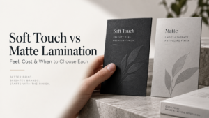
2. What finish? Uncoated natural kraft has the most authentic feel. Matte laminate adds durability. Soft-touch over kraft is genuinely premium. Gloss laminate tends to look wrong on kraft. The warmth of the material fights the slickness of the finish.
3. Do your brand colors survive the substrate? Get a physical print sample with your exact colors first. Ask your supplier for a kraft substrate proof. The screen-to-press difference on kraft is significant. A sample is worth the time.
4. Does your product need moisture resistance? Shipping through humid conditions? Storing in non-climate-controlled warehouses? Natural kraft’s absorbency is a spec issue. A coated or laminated surface fixes this.
5. Is FSC certification part of your brand story? Making sustainability claims publicly? Ask for FSC-certified kraft by name. Having the chain-of-custody documentation matters — both ethically and as a verifiable marketing point.
Find a supplier who knows the material. One who can advise on CUK versus natural kraft for your specific print spec. That conversation is the part most brands skip on first orders — and regret later.
Pricing and MOQs vary by specification. Request a custom quote for accurate details.
FAQ
What is custom kraft boxes packaging made from?
Kraft board comes from wood pulp processed using the kraft method. The process preserves long, strong cellulose fibers. The brown color comes from partial lignin retention. It’s stronger than most bleached alternatives at the same weight and requires fewer chemicals to produce.
Is kraft packaging more sustainable than white board?
Generally yes. The kraft process uses fewer bleaching chemicals and less processing than SBS. Kraft is biodegradable and widely recyclable curbside. FSC-certified kraft adds forest management accountability. “Sustainable” depends on the full lifecycle — inks, transport, end-of-life. Kraft is a strong baseline. Not automatically zero-impact, but a legitimate choice.
Can you print in full color on kraft boxes?
Yes, but with real limits. Dark and earth-toned colors print well. Bright, light, or pastel colors are affected by the brown substrate. They appear warmer and more muted. For accurate full-color printing, specify CUK. It has a white-coated print surface with a kraft exterior.
What’s the difference between kraft and CUK board?
Natural kraft is brown throughout. CUK (Coated Unbleached Kraft) has a kraft-look exterior but a white-coated surface where printing occurs. CUK achieves vivid full-color printing while keeping the natural brown exterior. It costs slightly more per unit.
What’s the difference between kraft paper and corrugated?
Kraft refers to the material. Corrugated refers to the structure — a fluted middle layer sandwiched between two flat liner sheets. Most corrugated boxes use kraftliner facing. So a standard brown shipping box is already kraft material in a corrugated structure. When people say “kraft boxes” they usually mean flat-board formats: mailer boxes or folding cartons.
How much does custom kraft boxes packaging cost?
Per-unit cost is broadly comparable to white board at equivalent specs. CUK runs slightly higher due to the coating. For mailer box formats at 250–1,000 units, expect $0.60–1.80 per unit depending on size and finish. Larger runs bring that down. Get an itemized quote for your actual dimensions. Catalog pricing rarely matches real spec.
Kraft packaging works because it’s honest. The brown color isn’t trying to impress anyone. It’s what the material looks like when you don’t process it more than necessary. For brands whose products carry that story, it lands well. The mistake is choosing it for the aesthetic without checking your brand colors against the substrate. Hold a sample first. Print your actual palette on real kraft before you commit to a production run. The screen-to-press gap on kraft is significant — and that’s much easier to fix at the sample stage.